Shorter University - CIS1200 - Fall2012

Tuesday, October 2, 2012

In Conclusion

In conclusion, I'd like to say that I have enjoyed our CIS1200 class. Being as this was one of my first classes at Shorter, I wasn't sure what to expect. However, now that my first session is nearly over, I can write that, not only have the classes and the learninghouse portal met my expectations, they've greatly exceeded them. The learninghouse portal is very user-friendly, the links are well organized, and uploading assignments is a breeze. My experiences with the other students through the forums has been very positive. Everyone is very friendly and helpful. My professors have also been very helpful, with quick turn-around time on my emails and grading my assignments.

From: http://en.wikipedia.org/wiki/Shorter_University
Overall, I'm happy to say that I wish I had apply to the Shorter online program sooner. I cannot say enough good things about this program.

As for our CIS1200 class, I feel I have greatly benefited from the textbook chapters on Time Management and Study Skills. I have learned new ways of taking notes, such as the Cornell Note Taking System, study plans, such as the 5-day study schedule, and I have a new self-awareness of how I can more efficiently use my time. I feel that these are strategies that will continue to help me in the future.

Well, that's all for my blog! I'm awaiting Shorter Online Session II.

Monday, October 1, 2012

Powerpoint: Handouts

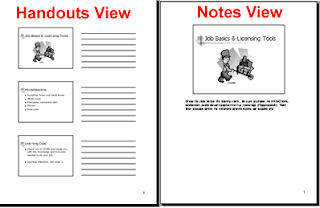
Powerpoint is not only a great presentation tool, it can also be a useful tool for studying. Sometimes professors use powerpoint presentations in their class lectures. For the Shorter online program, and other online classes I've had in the past, online professors sometimes make powerpoint presentations available to download and view. I've made it a habit to print a copy of these presentations in the Handouts view. They make handy sheets to take notes on and review.

From: http://blogs.mccombs.utexas.edu/the-most/2009/07/09/make-powerpoint-handouts-in-word/

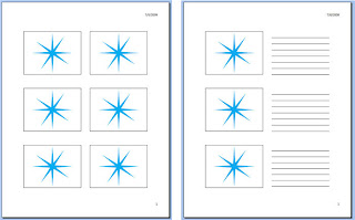
To print a copy of a powerpoint presentation in the Handouts view using Microsoft Office 2011 for Mac, a student would follow these steps:
  • Select Print.
  • Once in the Print dialog box, next to the text "Print What" select how many slides you want per page, between 2 to 9.
  • Generally, three slides per Handout is the right amount to take notes with. Powerpoint prints the page with nice lines to take notes on.
  • Next, decide if you want to print in Color, Greyscale, or Black & White (printing in Black & White can save ink and money!)
  • Then, hit the print button and gather your pages.

From: http://www.wa.gov/esd/training/quickguides/xp_pptwordprint.htm
Now you have another helpful study tool!

Saturday, September 29, 2012

Powerpoint 2011 for Mac

In addition to the links listed in our CIS1200 class this week, I am also posting these Powerpoint 2011 for Mac Youtube videos for future reference. While Powerpoint for Mac and Windows is basically the same, some of the commands for Mac will be different. Also, our class covers Powerpoint 2007, and since I have an updated version, I think some of the buttons are arranged differently. I found these videos to be helpful in completing my assignments this week. Youtube is full of great how-tos when it comes to software.


Thursday, September 27, 2012

Powerpoint Presentations

I can't believe it's the last week in CIS1200 already! Time has really flown by. This week we're reviewing how to use Microsoft Powerpoint and some tips on how to create and present better presentations.

From: http://www.atrixware.com/blog/wp/what-makes-a-powerpoint-slide-good/
Here are the Powerpoint links that I've looked at so far:


I plan to look back over them in the future, because I know I'll probably be creating more Powerpoint presentations in other classes.

Now for some tips that I've learned.
  • Using the Powerpoint image example above, you notice that the background is kinda busy. This background might work well if you were selling vacation packages or presenting a personal presentation on your summer vacation. Otherwise, in other settings, it might not look professional. Although using vibrant colors is important, it's also important to keep the presentation simple. If a beach theme doesn't reflect your topic, then don't use it.
  • It's also best to avoid fancy fonts. The heading of the example is a fancy font. While, to me, it looks okay as a heading, it would not look okay if all of the text was set in that font. If you had twenty slides and all of the text was in that font, it would be annoying to read after a while. It's best to use a standard, tried-and-true font like Times New Roman or Arial.
  • With that said, the link to the 10/20/30 rule blog post was very insightful. It's a good idea to limit the presentation to 10 slides, only 20 minutes, and use 30-point font. You certainly want everyone to be able to read your slides clearly and you want to hold people's attention spans.
  • Make sure that the presentation can run on any computer! This is especially important for me, since I'm on a Mac, I've got to make sure that my Powerpoint presentations will work on any Windows computer that I use.

Sunday, September 23, 2012

APA formatting

Here are some good youtube videos on APA formatting:

For Microsoft Office 2007 for Windows:


For Microsoft Office 2011 for Mac:

Friday, September 21, 2012

Using GALILEO Search

Some of our assignments this week call for using library databases, such as GALILEO. I found a very helpful Youtube video titled "Getting Better Results in GALILEO" that I wanted to share here for future reference.

Thursday, September 20, 2012

APA Writing Guidelines

This week we're reviewing how to use the APA writing guidelines. APA was developed by the American Psychological Association. For school purposes, it is mostly used in Psychology and Science classes. The majority of the papers I've had to write in my school career have required the MLA citation style. However, it's important to review the proper way to cite APA, as not to confuse it with MLA, because while similar, they do have their differences.

From: http://theportableblender.info/apa-style-term-paper-sample-6/

One of the first differences between MLA and APA, that jumps out at me, is the fact that APA requires (if the professor requests it) a title page and an abstract.

According to Hodges' Harbrace Handbook, fifteenth edition, a title page includes:

  1. The manuscript page header
  2. The running head
  3. The title
  4. The author's name
  5. The author's affiliation
An APA abstract is basically a short summary of the paper, not over 120 words.

A great link that I found from the Lesson Lecture APA Tutorial shows an example of a correct APA title page and abstract: http://supp.apa.org/style/PM6E-Corrected-Sample-Papers.pdf 

From: http://jeps.efpsa.org/blog/2012/07/10/the-origins-of-apa-style-and-why-there-are-so-many-rules/

Another difference between APA and MLA, is that APA only requires the author's last name and the publication date for a source quoted within the paper's text. In MLA, a book's page number is used.

All of the sources used are organized alphabetically on the Reference page. Here is a link for an example of a correct Reference page: http://flash1r.apa.org/apastyle/basics/data/resources/sample-references2.pdf